How to Make Sure Your Website Reaches Patients With Low Health Literacy
- Blake Rodocker
- June 17, 2014

Imagine this: you have just spent thousands of dollars on a revamped website that you’re hoping will get your healthcare organization greater exposure. Your new site is innovative, packed with information, features built-in tools to increase engagement and online communication, and is optimized for search engines so that existing and prospective patients can find you. The problem? People coming to your website are leaving quickly, they aren’t using your online tools, and your patients are complaining that they can’t find what they need.
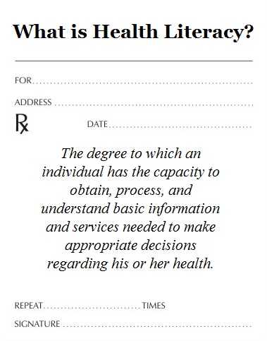
If this scenario sounds familiar, it could be that the website was not designed with your patients in mind. Healthcare organizations, it turns out, often fail to take into account that approximately one-third of U.S. adults have only basic or below-basic health literacy – and many don’t even speak English as their native language.
Supposing this stat is even minimally representative of your patient population, this means that a large percentage of people coming to your website are having trouble navigating the site and/or understanding the content. Here are three things you can do to make sure this doesn’t happen.
1. Test the reading level of your written materials.
For content that is easy to read at all reading levels, it is best to use words with one or two syllables when possible and to keep sentences short. This includes the content across your website, in addition to patient forms and educational materials.
Writing in a conversational tone can also make it easy for patient s to understand.
- Say: You could get skin cancer if you spend a lot of time outdoors.
- Don’t say: Long term exposure to the sun could result in skin cancer.
You should also try to avoid medical jargon and instead use words that your patients will understand. For example, saying “high blood pressure” instead of “hypertension” – and making comparisons to things people know (“the size of a pea” rather than “5 millimeters in diameter”).
While you might have patients that read at a high level and can easily understand the content on your site as it is, others will benefit greatly if you just keep it simple.
2. Use attention-grabbing images to help tell your story.
Having images on your healthcare website is a must – everyone knows that. What you might not know is that not all images are created equal. Some pictures and graphics can be more effective than others at conveying a message, while others can serve as a distraction.
In order for patients to really understand what you are trying to get across, try to incorporate visuals that help emphasize or explain messages that might be confusing. You might also want to consider labeling images with captions. For example, if you want to emphasize the importance of handwashing after handling raw chicken or meat, you can use an image of someone washing their hands and beneath that write something simple such as, “Wash your hands after touching raw meat.”
Using a mix of images and text can help you better convey a message, even if the person reading your website has below-basic health literacy.
3. Make a foreign language version of your medical website.
Do you serve a community with a large number of Spanish-speaking patients or an area where residents speak another language besides English as their native tongue? If so, it would be beneficial to your business to create a version of your website with translated content. Even if your foreign language site is condensed and only includes important pages, you will still be able to reach a new group of patients who might otherwise have left your site within seconds.
Remember: if it is difficult for a patient with low health literacy to understand something in their own language, image what their comprehension might be like when reading a language that isn’t their own.
This article was originally published on the MWE blog.